
Web Design Projects
Kurt Vonnegut • Dennis Lynch • Mr. Liz Hopkins

Kurt Vonnegut
American Novelist
After speaking with the Vonnegut family and discovering woes about the website’s representation of the author, we worked together to create a simplified, refined location for readers, publishers, and all people curious about Kurt.

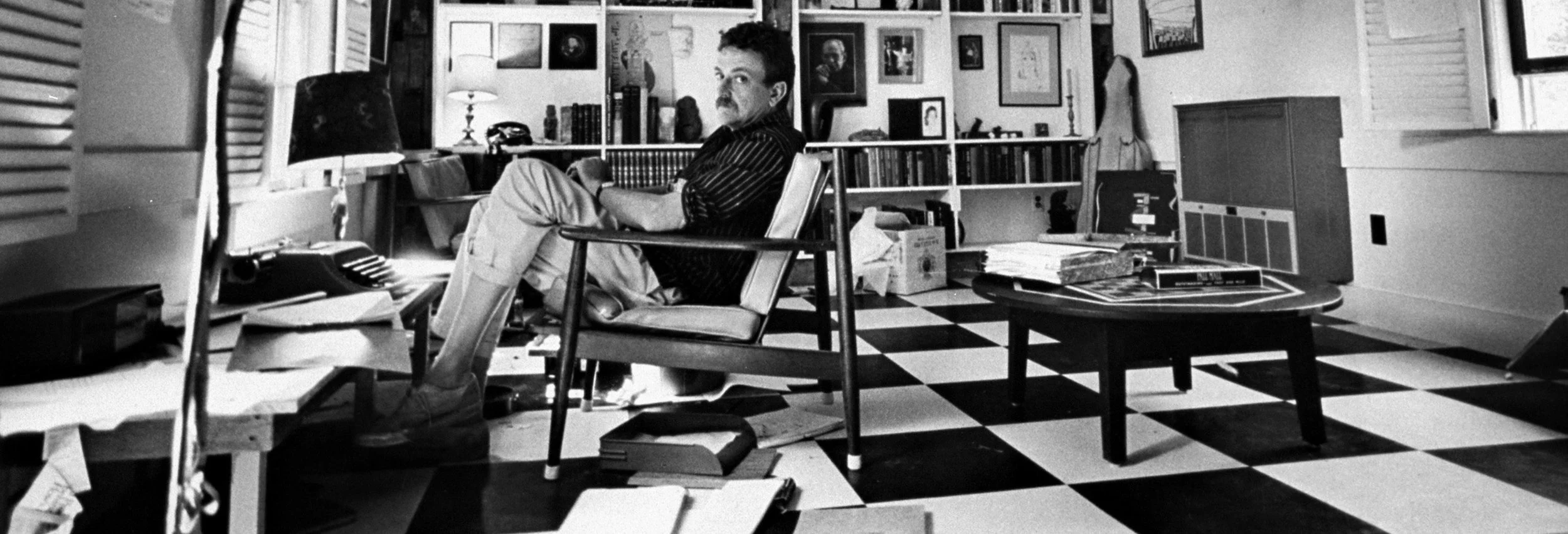
Kurt’s Words
A page to periodically post some of Kurt’s most poignant quotes. Inspired by Kurt’s writing study, I mimicked the checkered floors to create a layout for a text-heavy page. The whimsical shapes of his study door inspired the long oval menu bar and the color selection.

Dennis Lynch
American Journalist
An online publication in partnership with journalist Dennis Lynch during his coverage of the refugee crisis at the Ukrainian border.
As I sat down with the client, it was important to know what constraints were at hand: Was there to be imagery/media involved? What kind of publication were we aiming this to be? What’s the tone of the writing?

Developing a Style Guide from Comparative Publications
A side menu that was viewable and accessible regardless of where a user was on the page.
Photo captioning, title and subtitle heirarchy, typeface style trends, and formating of information such as the date, were derived from the New York Times and the Atlantic.

Title - a unique serif typeface, much like the titles for articles seen in the NYT or Atlantic.
Subtitles and body - A different serif typeface, Georgia, not only as a way to differentiate from the title, but also because Georgia is known to be one of the easiest typefaces for the human eye to read.
Navigation, contact info, date, and captions - san serif typeface Futura made sense in terms of readability for smaller sized text and differentiating itself from the content of the article.
Accessibility Decisions
-No frills. Minimal.
-Make the content as accessible as possible.
-Create focus and reduce distractions from the content.
-Reflect the tone of the subject matter.
-Black background to reduce blue light exposure to the eyes, while maintaining a contrast with white text for all content.
-Menu/navigation anchored to the side of the page would make all content viewable and accessible from anywhere on the page.
Areas for Accesibility Improvement
-Increase of font size.
-Setting up captioning and descriptions for assistive technology.
-Tagging elements such as buttons and links for assistive technology.
-Ensuring the page is navigable via keyboard.

Mr. Liz Hopkins
NY-based Artist
Working alongside NY based artist Liz Hopkins to showcase their work to prospective clients through minimalist design elements that allow their visually striking pieces to take center stage. Involved in person and remote collaboration, mock up sketches, information architecture to inform user flow creation, and a balancing of the client's sensibilities with user accessiblity.